LET'S CHAT!

FILL OUT THE FORM  OR JUST SHOOT AN EMAIL DIRECTLY TO HELLOLEIGH@GMAIL.COM


123 Street Avenue, City Town, 99999

(123) 555-6789

email@address.com


You can set your address, phone number, email and site description in the settings tab.
Link to read me page with more information.

AL_overhaul_header@2x.jpg

Angie's List Visual Overhaul

Adirondack is the perfect template for self-starters and savvy entrepreneurs. Its minimal navigation and full header images provide a bold framework for your brand's vision.

Angie's List Visual + UX Update


ROLE:

• Branding
• Visual Design
• Wireframes & UX
• UI Design
• Art Direction

DETAILS:

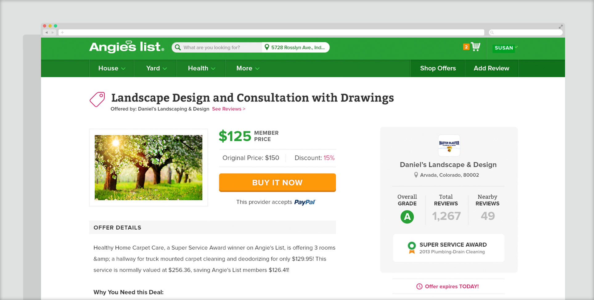
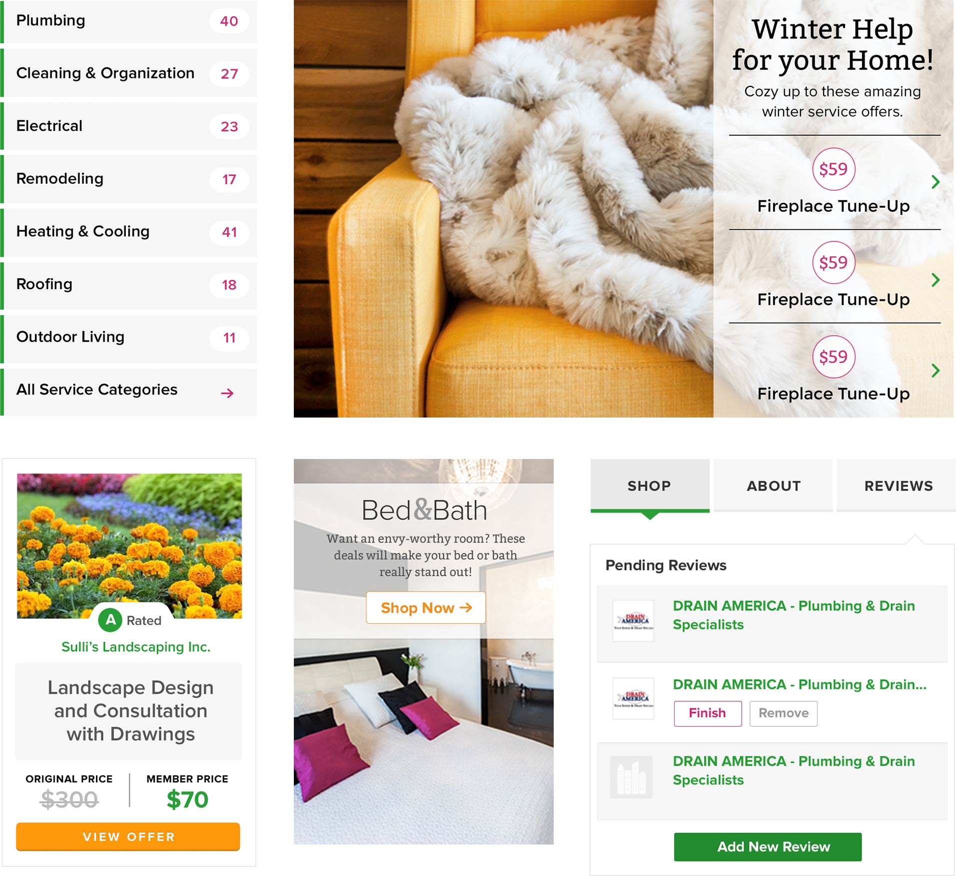
When I came on as Lead Product Designer for Angie's List, I was given the opportunity to completely refresh and reinvent the visual identity of the brand, starting with their core product - the website interface. The current look had not been updated in quite some time, so the timing couldn't have been better. Not a simple task, though, this re-think needed to account for every single visual representation of the large business. Everything from the main color scheme, fonts, UI, print materials, online ads, TV commercials (and so on and so forth) needed to be considered. I spent months creating the initial concepts, style guide, ui kit and art-directed other designers to carry the vision out in their respective departments. The website not only received a visual makeover, but also a full UX enhancement, as well as, the incorporation of new business initiatives, features & product offerings.  As to be expected with a project of this scope, only certain aspects have been released to the public and some of those are displayed below.


Above, you'll see the updated color scheme & digital font selections. The old color scheme relied almost solely on a very strong yellow and green, resulting in a bit of over-saturation (for the web, especially), while the fonts had been chosen in a time before type-kit & google fonts. The new colors offer a more palatable green, a contrasting orange for call-to-actions and pink for small, but important touches, while the fonts offer a bit of personality to represent the friendly, but trustworthy "neighbor" feel that the brand stands for.


Mostly known for reviews, Angie's List has made large strides in the e-commerce space by selling deals offered by service providers. By applying the new visual design, re-evaluating the UX, and A/B testing against the original version, we were able to significantly increase the conversion rate of what could be considered the single most important screen on the website.


As seen in the hero image at the very top of this page and some of the selections above, a new "lifestyle" representation was introduced to give customers a sense of aspiration to how'd they feel after the work was done or with the free time they would have from hiring a service provider. This direction can be compared to the more cut-and-dry presentation before. Additionally, (on the bottom left) I re-designed what's called the "Offer Card" which can be seen across the site and is also a key-converter. I worked with the user-research team to carry out extensive user-testing to optimize the new design. Lastly, you will see some basic interface elements that were updated to give a friendly and breathable aesthetic.


This is the re-design of the screen a paying member sees upon login. It's an update of the previous version, but with the new visual look applied and aims to give the member more of an elevated, almost VIP experience.